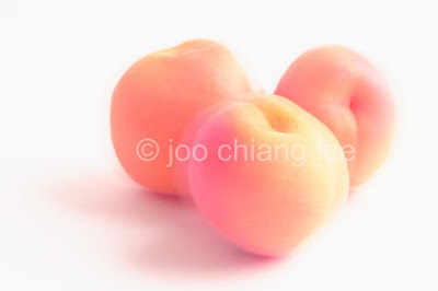
I ended up making quite a few copyright layers for future use; grey, faded white, embossed etc. The faded white © was used here as you can see. It is not clearly visible yet it is there in the center of the image so it does not interfere with aesthetics of the image. The process is a breeze once you have done a few and you will be able to make many variations to suit each image. The "©" symbol can be found in Character Map in Windows (My Program -> Accessories -> System Tools -> Character Map). Copy and paste that onto a new layer. Make sure you select transparent for the layer. Once you are happy with the placement of the symbol, adjust the opacity to 15-22% save the file in psd format. Voila, your copyright layer is ready to use. To add to your image, just move or drag it to the image, move it to the position you want (center is the choice), adjust its size with Free Transform. Remember to lock the aspect ratio so it does not turn into some strange looking oblong C.

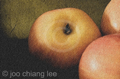
The above image of three apples came from an uninspiring photo I shot a while back. Despite it being a really flat and boring shot, I thought it has the potential as a starting image for my art. First I tweaked the levels a touch to make it look more dramatic, then a pass with an artistic filter. I also adjusted the stroke width to make it look more impressionist. I then added a little noise to arrive at the resulting antique look. Now it is looking like the old Parisian serving tray I shot the image in. When I get it printed, I shall don an old classic wooden frame around it before it goes up the wall next to my book collection :)

Moral of the story? It always helps to have a decent photo to start with. I know that is highly subjective but after a while you will be able to spot one that holds promise and one that is going to be a disaster no matter what you do to it. The above photo was a shot I almost deleted. My camera was set on a tripod but the peach in front swayed just as I clicked the shutter resulting in a distracting fleeting shadow. Here I tweaked the RGB colors individually and adjusted the hues which produced a rather pleasing image in the end.
I had a day of creative fun. I am going to print at least one of them in a poster size format using an online print shop, which will really be the test if my rendition is any good......I shall post a follow up blog then.
Here is the link to Canon Digital Professional Software in case someone is interested.
No comments:
Post a Comment